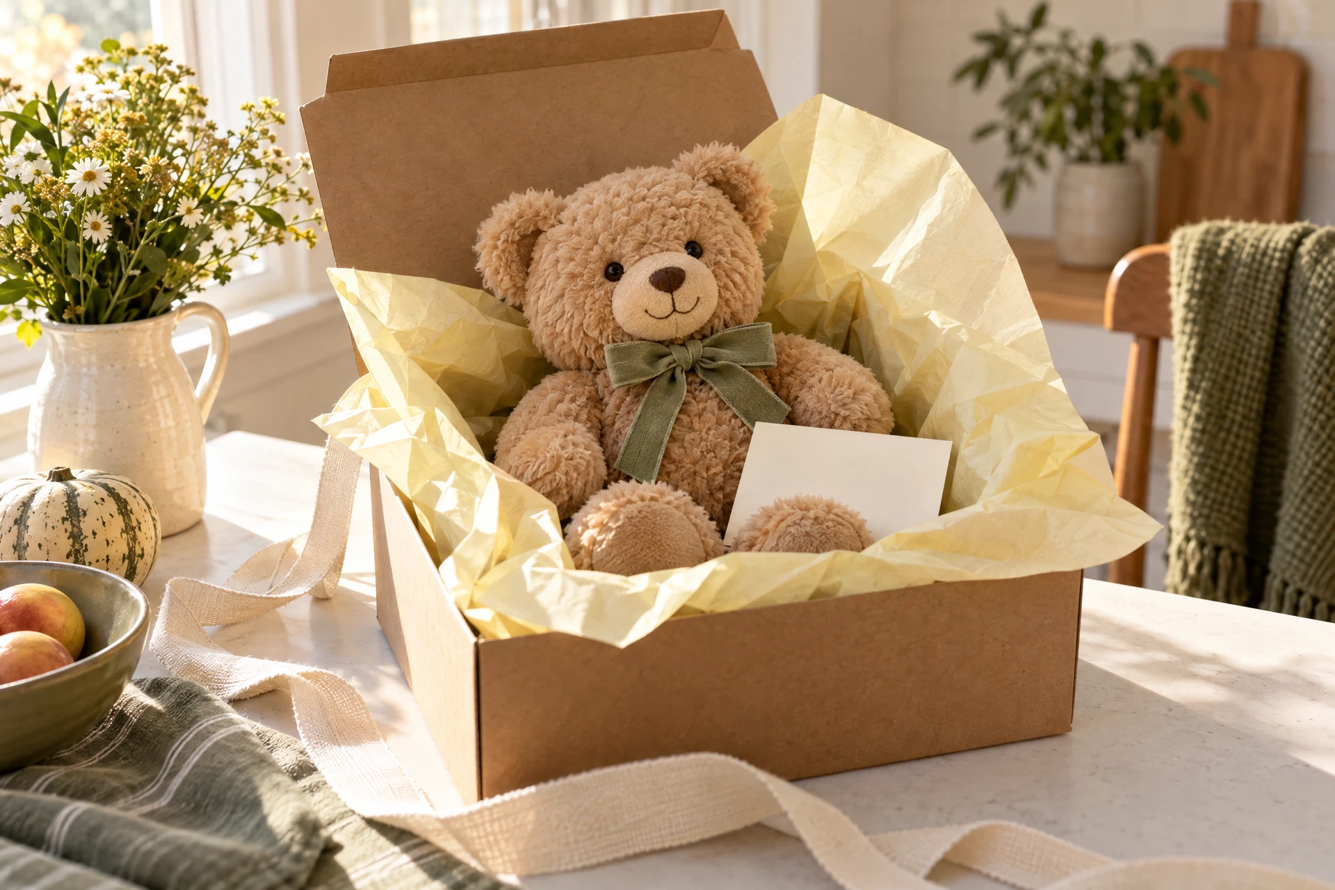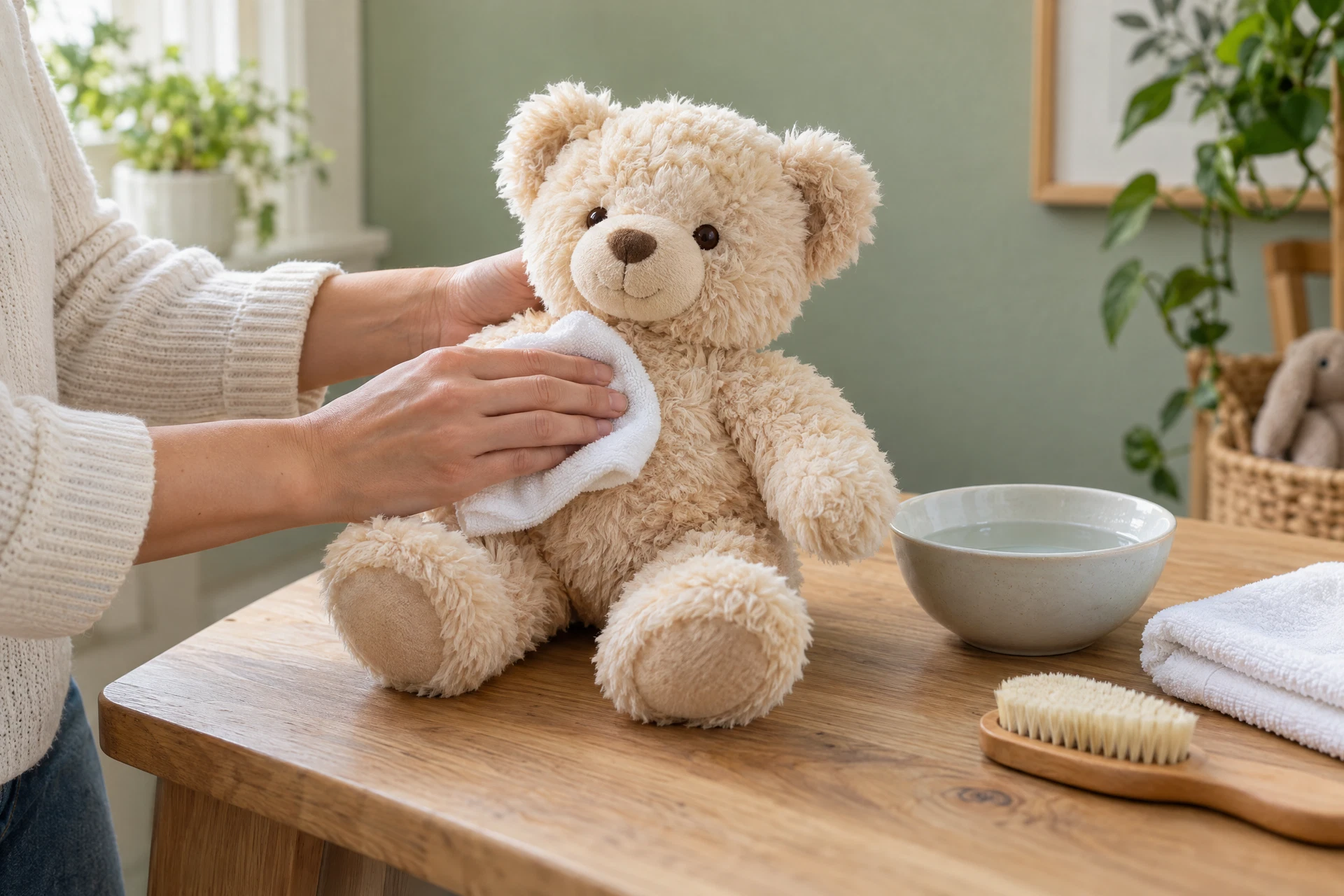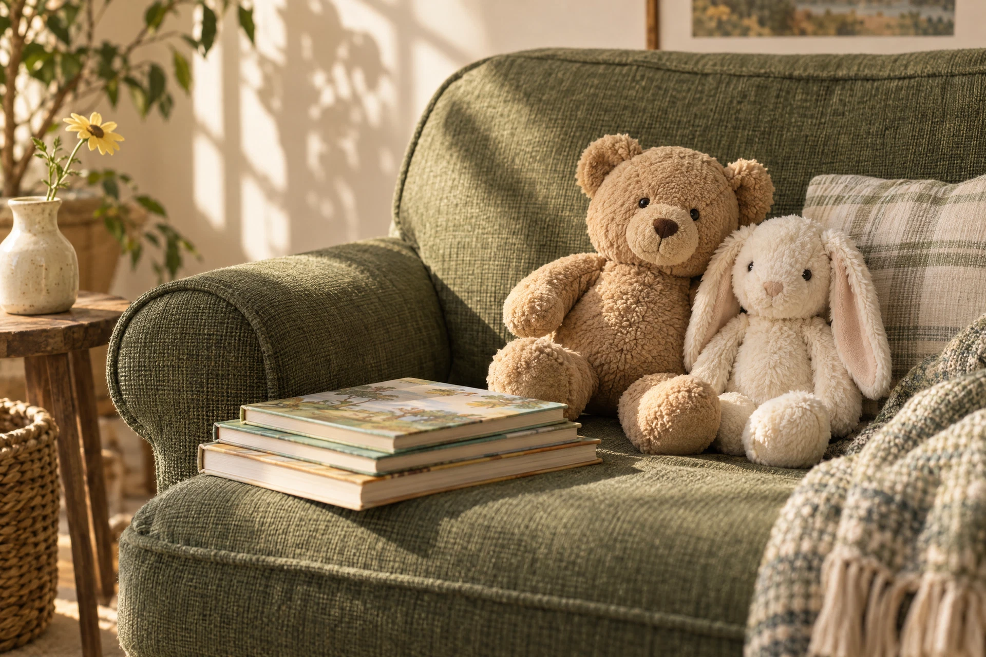
A reading corner is a small habitat within your home where comfort and focus meet. Choosing plush colors for a cozy reading corner goes beyond picking a favorite hue: the colors you surround yourself with influence mood, perceived temperature, and how inviting a space feels. This guide narrows the topic to actionable choices — mood goals, contrast with walls and furniture, light considerations, and practical upkeep — so you can match soft toys and cushions to the corner you want to spend hours in.
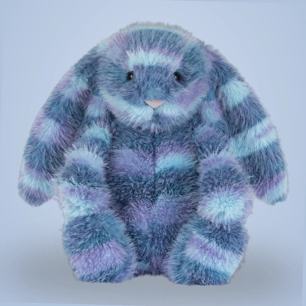
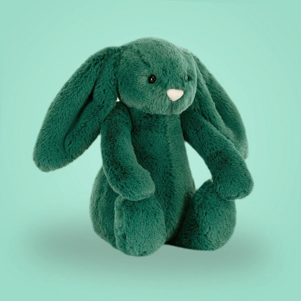
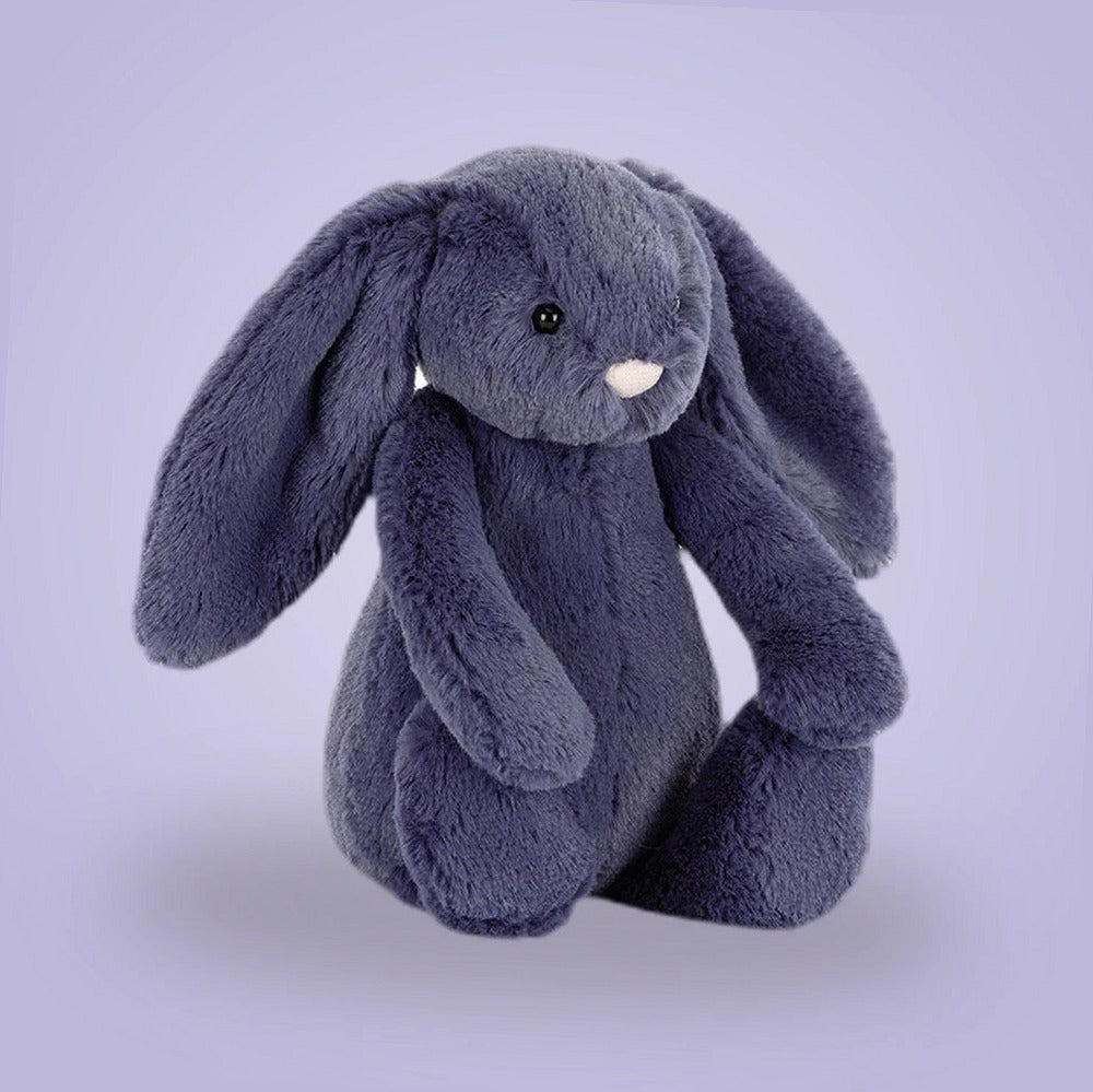
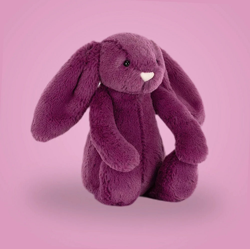
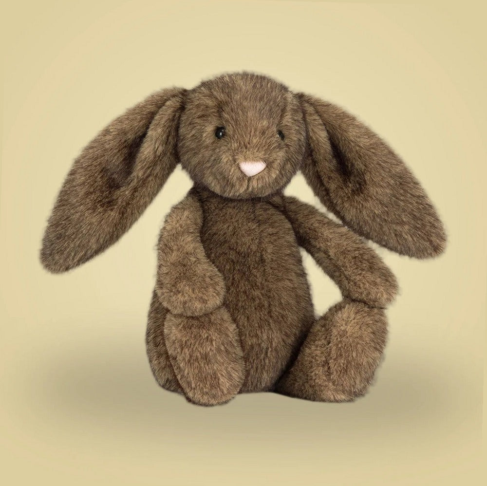
Before you start buying, gather decision criteria: what mood you want (calm, energized, neutral), the room’s dominant light source, and how much maintenance you’re willing to do. Also note existing textiles — rugs, curtains, upholstery — and the scale of the corner. If you’re browsing stuffed animal styles, you might also visit a specific collection like the Bunnies collection to see how a single color family reads when placed together.
Define the mood you want to create
When choosing plush colors for a cozy reading corner, start by naming the mood: tranquil, warm, whimsical, or focused. Tranquil leans toward cool, muted tones such as soft blues, sage, or dove gray. Warm moods favor terracotta, honey, and mustard. For whimsy, choose unexpected accents like melon or teal paired with neutrals. A focused corner benefits from low-contrast, mid-tone colors that reduce visual distraction and help the eye settle.
Create a simple checklist: 1) Mood name, 2) Two primary colors for larger plush pieces, 3) One or two accent colors under 20% of the collection, and 4) A neutral base for balance. This checklist keeps purchases intentional and prevents an over-saturated corner that fights relaxation.
Assess lighting and its effect on color
Light dramatically alters how plush colors read. Natural north-facing light tends to mute warm tones and make cool colors feel crisper; east- and west-facing windows change color temperature throughout the day. Under strong warm bulbs, blues can look gray and mustards will intensify. Observe your corner at reading time and take photos at that hour to judge what shades actually look like in use.
Practical test: hold or place a few plush items where they'll sit and live with them for a day. If you don’t yet own pieces, compare fabric swatches or product photos against the corner at the same time of day. For accurate decisions, bring a warm and a cool sample to see which stays sympathetic to your lighting across the day.
Match plush texture to color intensity
Texture and color work together: high-pile plush reads richer and can carry more saturated colors without becoming visually heavy, while short-pile or velour in a saturated hue can look flat or garish. When you want a muted look, choose softer, fuzzier textures in slightly deeper tones. Want punch and clarity? Select smooth finishes in bright accent shades.
Checklist to balance texture and color: 1) Reserve one high-pile piece for warm, saturated tones; 2) Use low-pile neutrals as background anchor; 3) Mix one tactile contrast (knit or corduroy) to break monotony. This keeps the corner visually layered and comfortable to touch.
Consider scale and grouping of plush pieces
Scale affects perception: several small brightly colored plush toys can create a playful cluster, whereas one large, vividly colored plush becomes the focal point. For a calming corner, favor a few mid-to-large neutral pieces with single-color accents. If you want a child-friendly, stimulating corner, distribute smaller colorful pieces across shelves and seating so color is spread evenly.
Guideline: use the 60-30-10 rule adapted for plush collections — 60% base neutrals, 30% secondary colors, 10% accent hues. For example, three neutral cushions and one large dove-gray throw (60%), two mid-tone plush animals in muted blues or greens (30%), and a single bright coral accent (10%). This makes the corner cohesive while still lively.
Coordinate with existing textiles and furniture
Your reading corner doesn’t float — it sits on rugs, against walls, and often near bookshelves. Pull one color from an existing textile to tie new plush pieces in. If the rug has navy motifs, introduce plush in pale navy or complementary warm tans to create harmony. Avoid introducing a new, dominant color unless you intend to restyle the whole area.
A practical exercise: spread out all major textiles and photograph them. Create a short list of three colors that appear most and use those as your purchasing palette. If you need inspiration for a cohesive toy pairing, check the our care guide page for maintenance tips so you know what you can easily maintain in your existing fabric mix and choose colors accordingly.
Practical maintenance and color choices
Color choices have care consequences. Very light plush picks up dust and visible stains faster, while deep saturated dyes may show fading unevenly with sunlight exposure. Before committing, read the product label for cleaning instructions and plan for realistic upkeep: spot cleaning, gentle washes, or professional care. Never assume every plush can be machine washed; refer to the individual manufacturer’s label and care instructions.
If you want low-maintenance color strategies, pick mid-tones and patterns that disguise wear, and select removable covers where possible. Also think about storage: rotating plush seasonally reduces UV exposure and keeps colors from fading unevenly.
Common mistakes to avoid
A frequent misstep is overloading the corner with too many competing hues. Even if each plush looks attractive online, a crowded palette creates visual noise. Stick to your 60-30-10 distribution and resist impulse buys that don’t fit the established mood. Another mistake is ignoring scale; tiny bright toys clustered without a grounding neutral will look cluttered rather than curated.
Also avoid matching colors to trends alone — trends can conflict with your lighting or existing decor. Test in place, use swatches, and if buying multiple pieces from a single source, ask questions through the contact page to clarify color depth and finish before purchasing. That extra step often prevents disappointment when items arrive.
A small actionable example
Imagine a corner with a deep forest-green armchair, honey oak bookshelf, and warm east light in the morning. Mood goal: calm and slightly cozy. Apply the checklist: Mood = calm; Primary colors = muted teal and oatmeal; Accent = soft mustard; Neutral base = warm gray. Purchase plan: one mid-sized teal plush to sit on the armchair (primary), two oatmeal cushions for the chair back and floor (neutral), and one small mustard plush for the shelf (accent).
Placement and assessment: Put the teal plush where you read; the oatmeal cushions create a soft frame and the mustard accent on the shelf ties to the bookshelf’s warm wood. Live with the arrangement for a week, observing how the colors read in morning and afternoon light. If mustard feels too bright, switch to a less saturated amber or move it to a lower-visibility shelf. For suppliers or bulk inquiries, review wholesale options on the wholesale inquiries page and confirm care guidance on the label before finalizing choices.
Explore the details before choosing
Take a closer look at Bunnies, review our plush and clothing care guidance, or ask about specifications and availability before making an order request.